Control: Bar
 |
|
Description
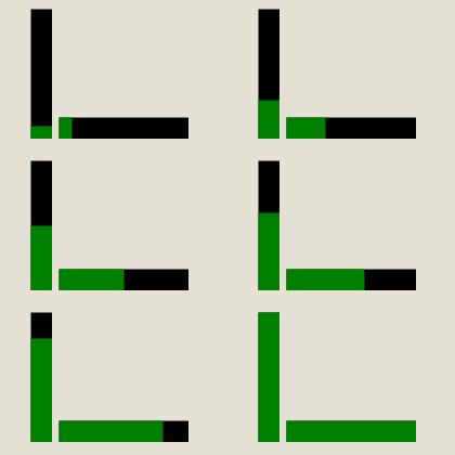
A Bar(Level) control can be used to display a value as level/progress. The value can only be updated with a tag. The Bar control is only available in the operator windows control.

Creation
Open the destination window to add the Control.
From the Toolbox, select the Bar icon, move the pointer into the window and drag out the initial position and size.
Access
If the Property Editor is not displayed, click on Ribbon > Home > Property Editor
Click on the Control. The Properties for the control will appear in the Property Editor panel and allow changes to be made.
Properties
| Name | Description |
|---|---|
| Name | Name of the control |
| Alias | Alias of the control |
| General | |
| Value | Current value of the bar(level/progress).Can only be updated via tag binding |
| Min Value | Default = 0 Minimum value of the bar. |
| Max Value | Default = 100 Maximim value of the bar. |
| Template | Select a template to use for this control |
| Layout | |
| X | X location in the window to place the control |
| Y | Y location in the window to place the control |
| Width | Default = 20 Width of the control. |
| Height | Default = 120 Height of the control. |
| Anchor | Which edge of the window the control is anchored to when the window is resized |
| Visual | |
| Visible | Default = Visible Visibility of the control. |
| Orientation | Default = Vertical Orientation of the control to be Horizontal/Vertical. |
| Value Color | Color of the level based on current value |
| Back Color | Background color of the control |
Binding
The following properties may be bound to a tag
- Visible
- Value
- Value Color
- Back Color